historic renovation

Designer Showcase, Kitchen Design

A Q&A with a Design Contest Winner on Transforming a Century-Old Kitchen

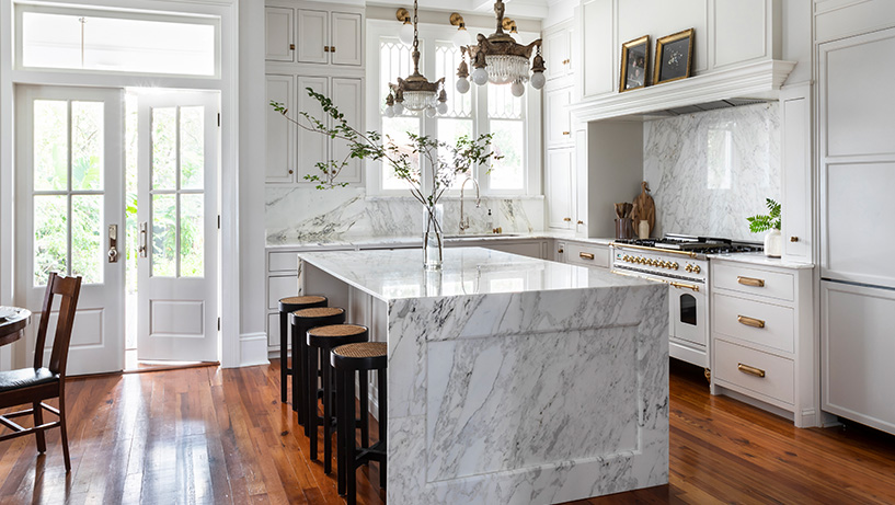
Renovating the kitchen inside a historic home is bound to have its challenges – especially when it’s been vacant for over 30 years. Winner of our Design Contest’s Traditional Kitchen category, interior designer Lindsey Snodgrass of Golden Key Designs worked on a 1905 Greek Revival home in New Orleans, Louisiana, and completed its new kitchen to seamlessly blend in with its surrounding architecture. A master class in tasteful restoration, the kitchen maintains the character of the original home while modernizing the space for 21st-century life. Waterstone Design Contest judge Cara Fox of The Fox Group described the winning design as a “[combination of] timeless and classic style with a hint of modern luxury and convenience. It’s elegant and the use of materials is perfectly balanced.” We spoke to the designer on how exactly she married the old with the new through careful material and fixture choices. 1. You said this 1905 home had been vacant for over 30 years – what was the home and old kitchen like before the renovation? The kitchen was definitely the number one area that needed care. It had a lot of termite damage. The ceiling had water intrusion problems and the cabinets were crumbling apart. On our first visit, there were even a couple squirrels in the ceiling!  The original exterior of the kitchen was very small and closed off from the rest of the house. The upstairs sun porch was actually falling down due to termite damage. The best option was to demo both and expand the kitchen across the entire width of the house. This allowed the kitchen to be much more open and functional for today’s lifestyle. It also allowed us to create a beautiful floor plan upstairs that added a primary suite. 2. What were the challenges in designing the new kitchen and how did you overcome them to meet the design goals? Our biggest goal was to carry the historical aspects throughout the new addition. We wanted it to be a seamless transition, and feel like it was always part of the home. The biggest challenge with this kitchen was probably the flooring. This doesn’t seem like a very fabulous aspect of the design, but to have the old floor tie seamlessly into the new, without a threshold or 1/2’’ rise was so important. I think how a floor transitions from one room to another, especially when it’s an addition, can dramatically make a difference in the overall flow and feeling of the space.  This was a raised home, which is very common in New Orleans, so it wasn’t as simple as laying a traditional foundation. To perfectly match the height of the original wood floors to the new flooring was a challenge. It was 100-year-old brick piers with rough cut wood sills and true 1’’ thick wood floors with no subfloor. Calculating it to match the exact height for new grade beams, with lumber that isn’t true to size as it used to be, adding subfloor and accounting for the thickness of modern long leaf pine floor boards was harder than it seems. Plus, most historical homes can easily be an inch off, over the entire width of the foundation that you’re tying into, so we had to account for that as well. It was a lot! I strongly believe it’s those details that make a difference in the outcome. 3. How would you describe the new kitchen’s style? I would say it’s a modern twist on French country. 4. How did you balance maintaining the character of the old kitchen and modernizing it? Did the homeowners have specific requests on what to keep, or what to buy new? Since this kitchen was almost completely new construction, we had to design the coffered ceiling, the trim work, the kitchen windows, everything from scratch and ensure it flowed with the rest of the home. It was important to keep and reuse as many of the old elements as we could.  There was a total of six doorways with transoms that were removed and reused throughout the home. You can see the original wood door in the kitchen, it used to lead outside, but now it leads into the laundry room. We kept the same angle of the doorway to match how it originally was leading into the kitchen, except it’s about 10’ over after widening the room. You don’t see it in these photos, but the living room doorway mimics the same angle, so we felt it was an important architectural aspect to keep.  Once we had the historical aspects finalized we were then able to add in the modern elements. The beautiful Paonazzo marble, the recessed panel on the island waterfall is probably one of my favorite elements. I think that was the perfect blend between modern and traditional. We also mixed new light fixtures with old ones. I am a big fan of Ralph Lauren’s line through Visual Comfort. The McCarren sconces modernized the lighting and complimented the vintage pendants perfectly. Then the custom stove really tied it all together in a perfect way. 5. The Waterstone Extended Reach Faucet fits so naturally into the space. How did you decide on this faucet and what does it contribute to the kitchen’s design? This kitchen needed a faucet that could be a feature all on its own. The extended reach couldn’t have looked better, the classic design went perfectly with this kitchen. Plus, it was honestly a must for the functionality of the 45’’ workstation sink. 6. Why did you decide to go with our Polished Nickel finish for this space? One of my go-to’s for historic homes is polished nickel. It’s just timeless to me. A fun fact is that nickel was the preferred finish in homes from about 1880-1930. I love the understated warmth it brings to a space. 7. How does the classic design of this kitchen relate to other kitchens you’ve worked on? Do you usually design historic homes or is this one
Designer Showcase

How to Use a PLP Faucet in 2 Dramatically Different Kitchen Designs

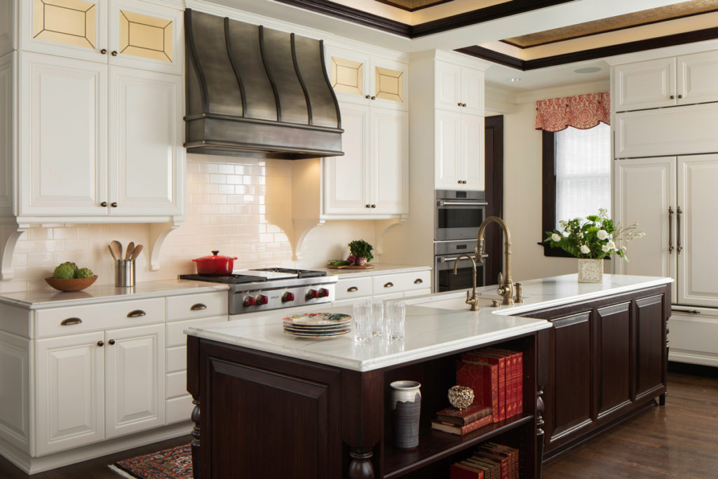
Designer Natalie Erickson from architecture and interiors firm Deep River Partners recently completed two renovation projects in Milwaukee: one a sleek and modern waterfront pied-à-terre, and the other a traditional Gothic Revival. The former, Harbor Front Renovation, is an industrial condo located in Milwaukee’s historic Third Ward, the city’s trendy, revitalized warehouse district, while the Gilded Age Restoration was an 1890s home refresh meant to bring modern functionality while honoring its history. Natalie joined us to discuss her experience designing these kitchens with distinct design (and faucet) needs What did each home look like before the renovations? Harbor Front Renovation: the interiors of this existing condominium were a bit tired, which did not reflect its trendy urban neighborhood. There were shiny maple floors and cherry cabinets that dated the space, and the open concept lacked definition between the kitchen, dining and family room. The existing ceiling was maintained as an element we wanted to play up. Through changing the finishes of the interiors, the wood ceiling became more cohesive with the space and an integral part to reflect the desired industrial design. Gilded Age Restoration: the renovation of this historic home touched all four levels and was inspired by gorgeous artisan details in the original woodwork, leaded glass, and finishes. The kitchen area was original to the house as was the floorplan, which was compartmentalized into an undersized kitchen, pantry, and butler’s pantry. The space was quite dated and lacked the features and functionality of a modern working kitchen. What were the goals in designing each project? Were there specific requests from the homeowners? Harbor Front Renovation: As their pied-à-terre, the homeowners wanted to walk into their renovated condominium and feel they were arriving at a high-end hotel. The design solution balanced the urban setting with the desired modern industrial theme comprised of a refined palette of black, white, and rift cut oak, with metal and concrete industrial accents. The new kitchen design brought better function and balance with the introduction of a strong centerline maintained by the range and sink as focal points. The black cabinets add a modern edge while white oak cabinets provide relief, and white quartz countertops marry the design elements together. Gilded Age Restoration: The homeowners wanted to update their residence to include modern conveniences while honoring the home’s historic character. They requested a larger kitchen with a casual dining space. The design solution combined the original kitchen, pantry and butler’s pantry to deliver a modern open design for the new semi-professional kitchen and built-in banquette for casual dining. The new floorplan improved connections to the entertainment areas of the home and increased lighting to brighten the space. The home welcomed a modern refresh with a transitional aesthetic, while staying true to the integrity of the home’s historic elements. What are the new outstanding features in each kitchen? Harbor Front Renovation: One of the greatest challenges was illuminating the kitchen without penetrating the existing wood ceiling or obstructing the views through the expansive windows. A rectangular LED fixture frames the island from above to define the kitchen and provides the main source of light, with both indirect ambient up lighting, and overall down lighting for cooking. Lighting underneath the upper cabinets and island counter emphasize the strong horizontal lines. The black cabinet selection provides contrast with the accent of white oak cabinetry at the upper cabinets, which really showcases the veining in the quartz countertops. Gilded Age Restoration: Playing on the original woodwork, leaded glass and finishes were inspirations for the more striking details in this refreshed design. Molding profiles and dark floors were continued into the kitchen for contrast with the new light cabinetry and countertops. Lighting elements in the leaded glass upper cabinets and ceiling further brighten the space. For a historic feel, the ceiling was enhanced with coffers and a faux finished wall covering to create the look of pressed tin. Cove lighting highlighted the new detail. A custom hood crafted with rivet details give a historic nod and provides a dramatic visual to the space. Which PLP faucets and finishes were chosen and how do they contribute to each kitchens’ design? Harbor Front Renovation: With the main selections in the kitchen being black, white, or white oak, we decided on the Modern PLP in Chrome to add some jewelry and shine to reflect in the kitchen and provide relief to the design scheme. We chose the faucet design for its clean lines and beautifully simple aesthetic. Gilded Age Restoration: We wanted a traditional faucet that looked like it could have always been with the home. The Antique Brass finish on the Traditional PLP from Waterstone is so beautiful and has just the right level of patina for an authentic look. How do you choose – or recommend your clients to choose – a kitchen faucet? When recommending a kitchen faucet, we typically start by looking for a pull-down faucet for function, especially at a main kitchen sink. To complete this workstation, we prefer a collection with a wide range of accessories and finish selections. The reason we love to source with Waterstone is because of the details in the air switch, filtered water faucets, and soap dispensers. The kitchen sink is a high use area, and these small details really add up to create a beautiful kitchen aesthetic that a client typically experiences multiple times a day. Can you walk us through the process of restoring a historic home like the Gilded Age Restoration? What are the challenges, specifically in a kitchen space? A preservation has more considerations for the exterior of historic structures. With this interior renovation, creating modern updates within the storied walls of this century old home did present its challenges. Our design team focused to honor the original moldings, millwork profiles and detailing of this historic home. The darkly lit home needed brightening, and the existing boxy floorplan was a design for another era. Opening these spaces to reconnect the heart of the home with the

Scroll to Top